Infographics are everywhere…
At first we had some great examples of infographics. Graphics that communicated information (message, question, data) to an audience. What distinguished some of the leading infographics was their ability to provide a tremendous amount of insights and inspire thinking. One of the most talked about and best examples of infographics was Charles Minard’s Napoleon’s March which described the march (and subsequent retreat) of Napoleon’s army towards Moscow in the winter of 1812-1813.
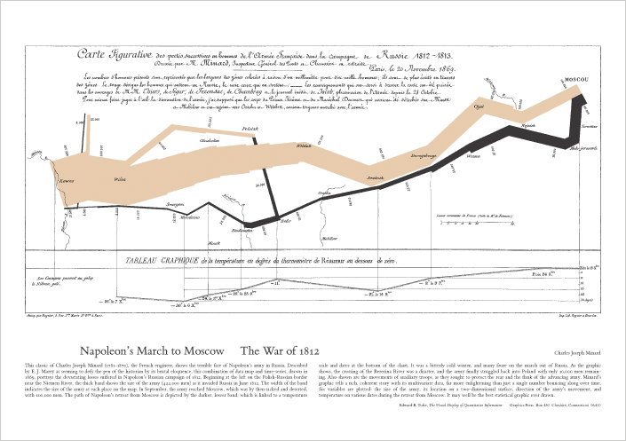
(Image above from Edward Tufte Poster Library – get your own!). There are many distinguishing characteristics for this infographic, but in my opinion the most important characteristics is it’s ability to show a number of dimensions (geography, army size & split, time, weather) in a compelling way so that the audience can insights quickly (the army was wiped out), while being able to focus on some of the details. This can become the starting point for a lot of conversations and discussion about what happened, and what can be learned.
Fast forward to 2008-2010… We’re now seeing so many infographics, to the point of gimmickry. I present to you one such example from Gigaom

(UPDATE 2013-01-19 – I’ve been told the link no longer works consistently, I’ve updated with a link from the Wayback Machine)
What we see here, is essentially an abuse of typography to put information in a graphic, and really there are only three charts that considered to be part of an information graphic. This is really a missed opportunity, and actually does not convey any information that could not be conveyed through text and a couple of charts. So the primary value that this infographic provides is the graphic design (whose quality can be debated).
There’s a broader issue here. We are seeing history repeat itself. The same thing that happened with Powerpoint (much has been written about this). The reduction in software cost (or at least availability of lower cost software), coupled with more power in our devices, is making is easier and easier for anyone to make graphic and claim that they are infographics, and thus potentially failing to actually inform with their graphics.
Leave a Reply
You must be logged in to post a comment.